Caption: Image of the US Department of Education College Scorecard page. We performed exploratory data analysis primarily on information from the site.
Worth It: Understanding the Value of a College Education
Spring 2020 | 2 Weeks
Let's face it: college, for most individuals, is an expensive investment. For instance, tuition at Carnegie Mellon without financial aid is over $55,000. College tuition overall has increased over 25 percent in the past 10 years and student debt, just between 2018-2019, has increased over 6 percent (CNBC). Thus, the value of a college education must be evaluated before making such a life-changing decision.
Return on investment (ROI) is often used to determine the value of a college education. In this exploratory data analysis project, Catherine Du and I wanted to take a deeper dive into what factors increases the ROI of a certain college education. Specifically, we wanted to answer the following questions:
- Does a school’s ranking increase the value traditionally lower-paying majors?
- Do majors in high demand get paid well regardless of institution?
- What is the relationship between starting salary, debt, and location of a school?
This project was done for the Practical Data Science course (67-364) at Carnegie Mellon. To skip directly to the final deliverable, please click here.
My Role
In this project, I was a Data Visualizer and used Tableau to visualize trends and relationships. In addition, I helped clean and process the data for explortory data analysis with Pandas.
Process Overview
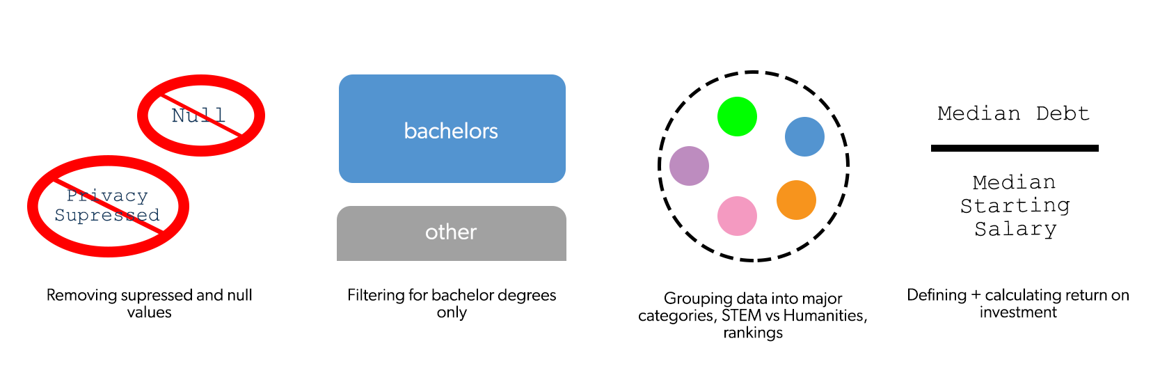
To analyze our data, we first had to transfrom the raw data into a form that could be readily used and analyzed. The diagram below shows how we cleaned/prepared the data using the Pandas library in Python. Note that though there are many ways to calculate ROI, we used debt to starting salary ratio as our metric since both debt and starting salary are numerical factors that influence the financial wellness of college graduates.
Results
To answer our three questions, we performed exploratory data analysis on our cleaned dataset. Here are some of our findings:
On average, the higher the prestige, the lower the debt-to-salary ratio
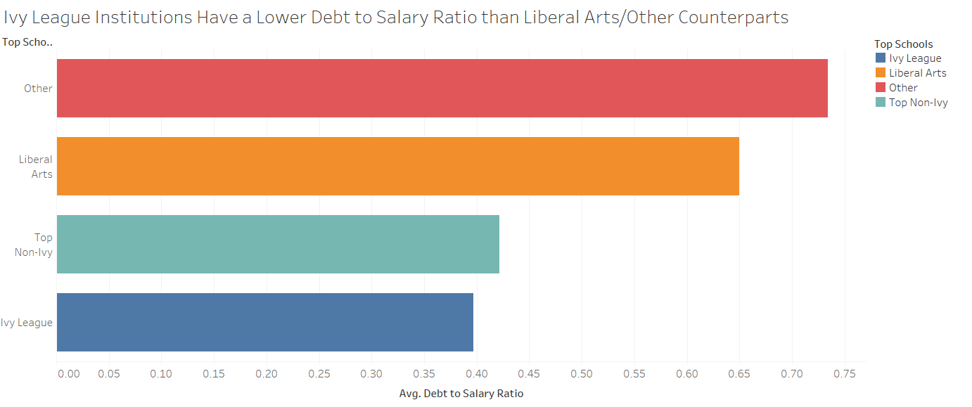
Caption: Bar graph of average debt-to-salary (DS) ratio plotted by college group. Top Non-Ivy schools are the top 30 ranked schools listed by the US News Rankings 2019. Note that the average DS ratio for Ivy League schools is almost half of that of schools in the 'other' category.
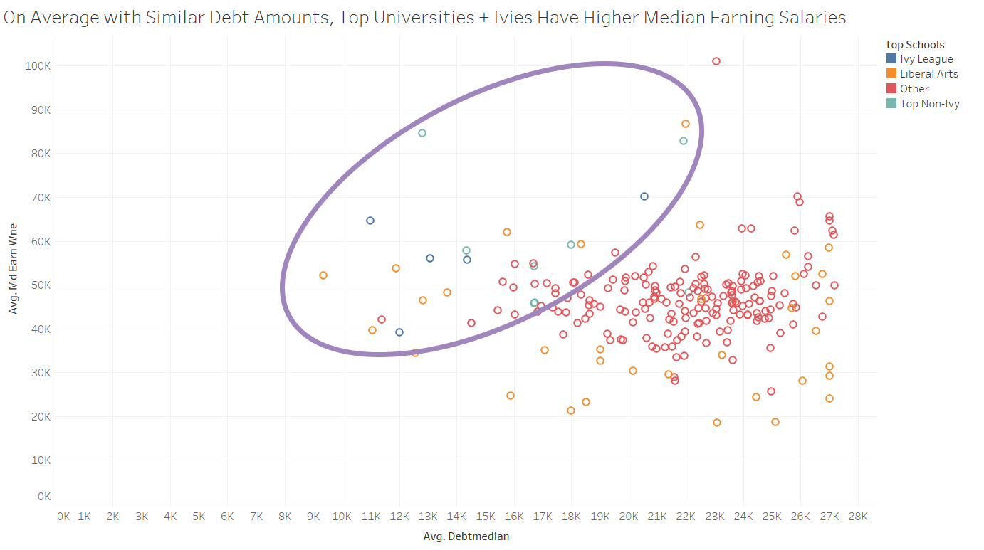
Caption: Scatterplot showing colleges plotted on average debt and average earnings. While we had over ~2000 colleges in our dataset, we randomly selected 200 for this scatterplot. Note that higher ranked institutions are aggregated to the left/top left of the graph (in the purple oval), indicating that even with similar debt amounts, students from these institutions, on average, had higher starting salaries.
STEM students, on average, are paid well regardless of institution. However, humanities majors at Ivy League institutions can outearn STEM students at other institutions
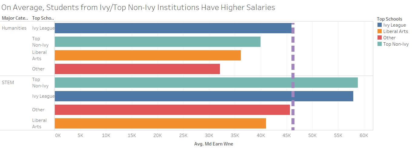
Caption: Bar graph of average salary plotted by major type and college group. Note that average non-STEM salary at Ivy League institutions is, on average, higher than that of STEM salaries in Liberal Arts/other institutions, as noted by the purple line.
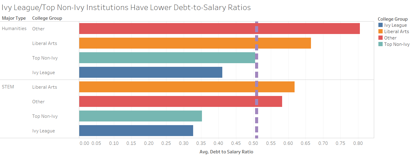
Caption: Bar graph of average debt-to-salary ratio plotted by major type and college group. Note that average non-STEM debt-to-salary ratio at higher ranked institutions is, on average, higher than that of STEM DS ratios in Liberal Arts/other institutions, as noted by the purple line.
Students who attend institutions in California or the Northeast, on average, have the lowest debt-to-salary ratio
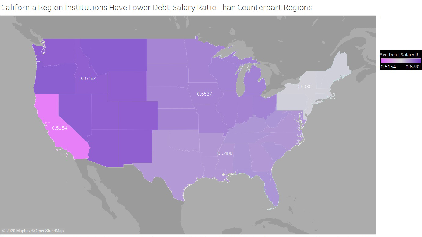
Caption: Map showing regional debt-to-salary ratios, with the California/Northeast with the lowest ratios.
Analysis
To place the numbers and results in context, here are some factors that explain the findings:
- It is commonly believed that selective colleges offer more connections and a stronger alumni network compared with other institutions. However, even with that aside, that selective colleges are composed of more students from the top one percent than the bottom twenty. Richer students tend to have higher salaries post-graduation, compared with other peers.
- Shortage of STEM skills leads to a higher demand for people that have these skills, thus higher starting salaries for those majoring in STEM.
- Many cities that have the highest salaries are concentrated on the Northeast and California. However, these areas also have the highest cost of living in the country.
These numbers, or even the explanations above, don't paint the whole picture of the college landscape. Here are some considerations that need to made when building upon these results:
- One major confounding variable was the way in which we calculated the debt-to-salary ratio. After making the corresponding groups on Pandas and given the way the dataset was structured, we took the average of the median salaries and debt amounts for each major. Thus, when calculating debt and salary in this manner, we made the assumption that there was an equal number of students in each major.
- Though value can be determined by looking at the numbers, such as looking at the average debt and salary post-grad, we also need to look at qualitative factors as well. Existence of the right communities, 'fit', campus climate, and overall college satisfaction are just some of these factors that creates value in a college experience.
- Though liberal arts degrees don't offer high-paying starting salaries when compared to STEM majors, studies show that individuals with a liberal arts background tend to have higher mid-career wage growth compared with those with a STEM background. In sum, one should study in a field that they are fascinated and interested in, big-picture wise.
Takeaways
If given more time on this project, we would build upon our findings by doing the following:
- Find different ways to calculate ROI
- Determine the effects in-state vs out-of-state and income levels have on debt and salary
Overall, this project re-emphasized how important exploratory data analysis is since there are many insights that can be drawn just simply by grouping and visualizing the data. I was able to refine my skills in Pandas and Tableau throughout the course of the project and had many assumptions about the college landscape as a whole challenged throughout the process.