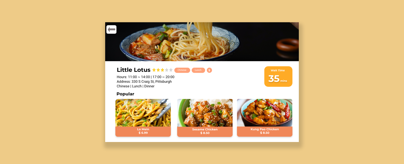
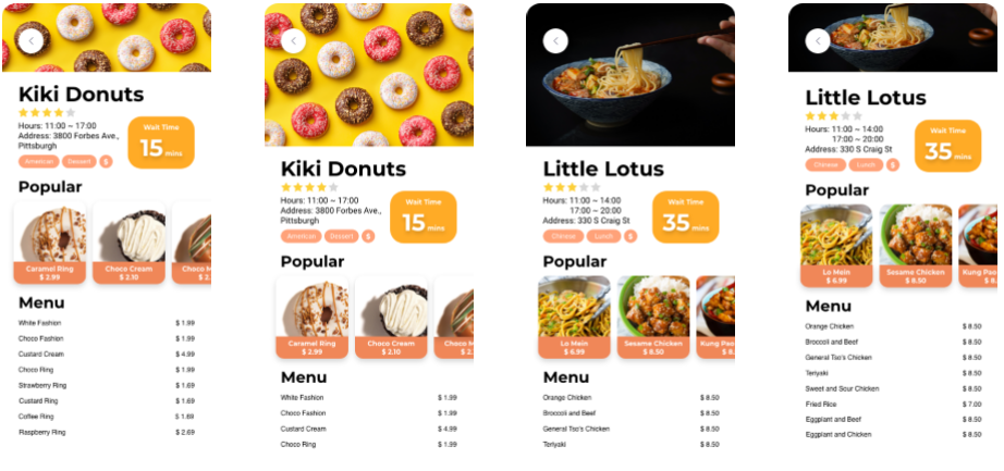
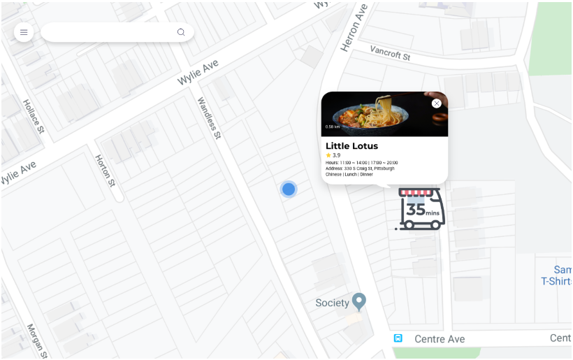
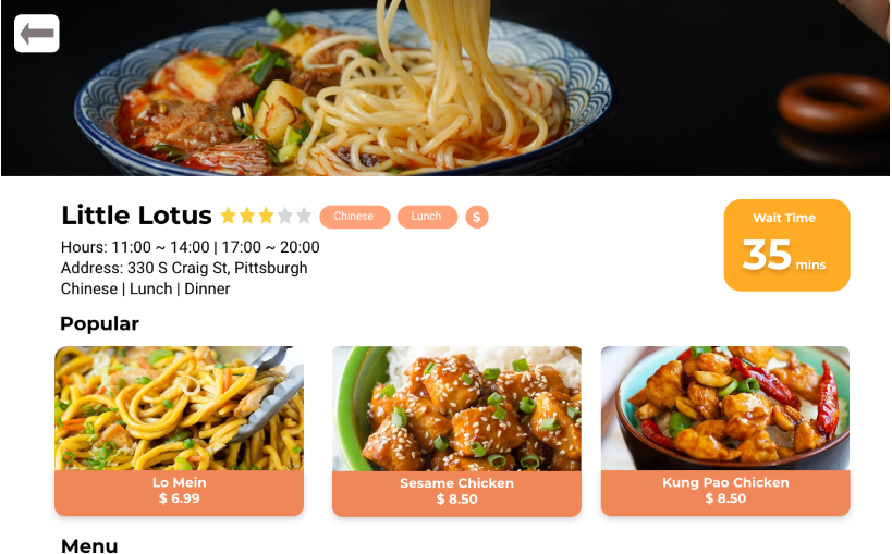
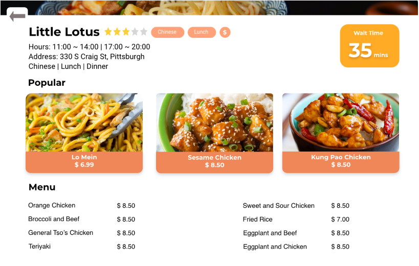
Caption: A page from the responsive web application that shows the business page for the Little Lotus restaurant.
Food Truck Responsive Web Design
Fall 2019 | 5 Weeks
"How might we connect hungry patrons to food trucks that fit their needs and restrictions?"
With a market worth over $1 billion and 6.8 percent growth from the past five years, the food truck market is thriving, offering customers quality meals centered around convenience. However, patrons often do not know which trucks fit their needs and constraints, given that an area can have many trucks.
In this team project with members Evelyn Yu, Ruwen You, and Sprina Wu, we designed a responsive web application that centralizes information, such as cuisine served and opening hours, into one spot where patrons can access. With varying patron constraints in mind, users can dine good while having time, dietary and/or budgetary needs met.
This project was done for the Interaction Design Overview Course (05-392) at Carnegie Mellon. To skip directly to the final deliverable, please click here.
My Role
In this project, I was a User Experience Designer and worked alongside my teammates each step of the way, from interpreting interview notes to creating the many iterations of the application. Majority of the tasks we did involved the following: experience design (including wireframing and prototyping) and conducting think alouds for usability testing.
Process Overview
The following lists what we've done in order to reach our final responsive website designs: understanding the users, making sketches and wireframes, conducting think alouds for usability testing, and making changes based off of feedback from the previous two activities.
Understanding Our Users
To kick off the project, we were given food truck user research (observations, interviews, affinity diagrams, personas) from another team. We were asked to use their insights to shape our design. The diagram on the bottom left shows some examples of customers we are targeting.
Since we did not conduct the research ourselves (since the research we've conducted was handed off to another group), we used a Venn diagram to synthesize information given + better understand the three key players in the food truck market: patrons, owners, and employees.
Customers are interested in...
- Cheaper food
- Businesses located in convenient locations
- High quality + variety of foods, compared with nearby restaurants
Truck owners are interested in...
- Higher returns/profits
- More business opportunities
- An established brand name, distinct from other businesses
Employees are interested in...
- Pay that corresponds reasonably with work put in
- Having good working conditions, including solid work-life balance
- Earning money
Some commonalities the groups share is...
- Accessing information easily (e.g. where customers/trucks are)
- Good reputation/brand name
- More personal recognition
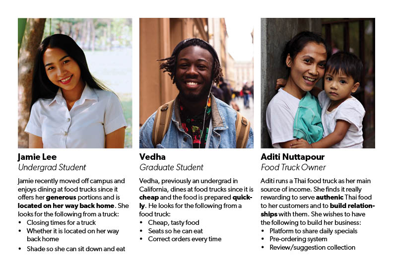
Caption: Personas of three individuals who are patrons of food trucks
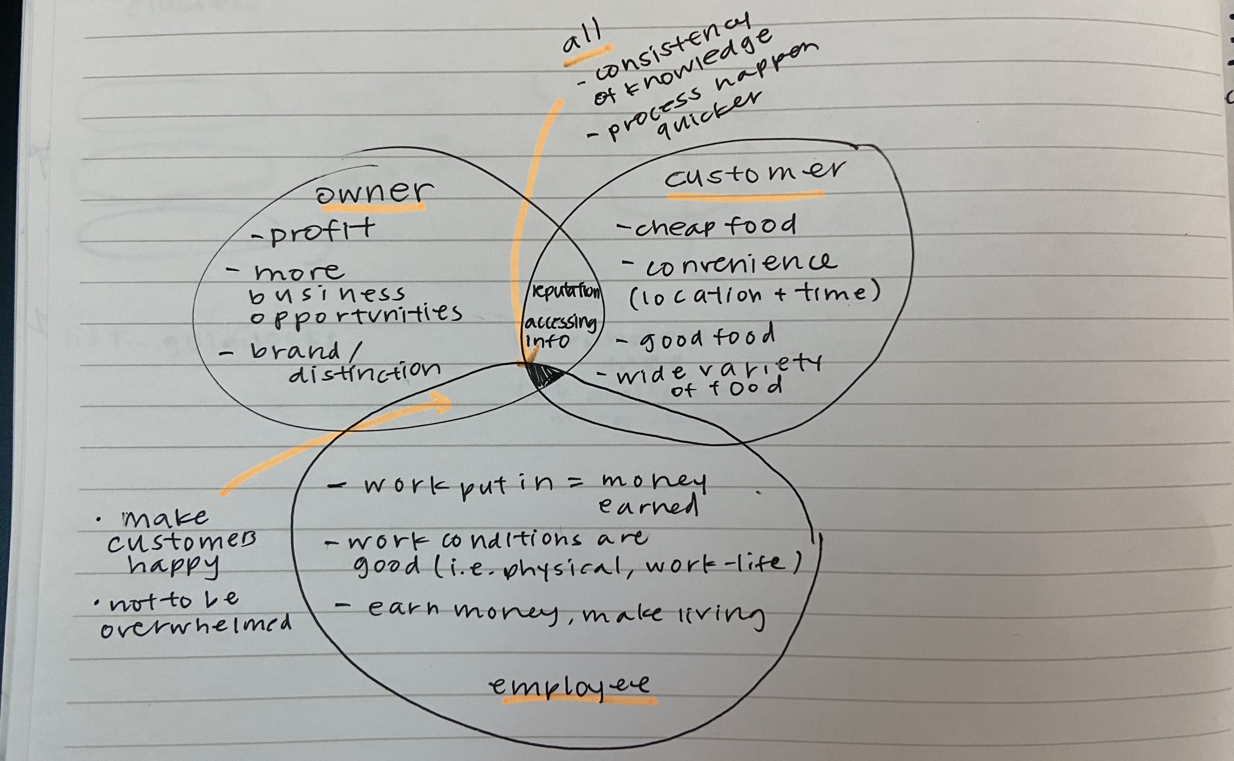
Caption: Venn diagram used to synthesize information from the previous team's research. Most of what's in the diagram is written above.
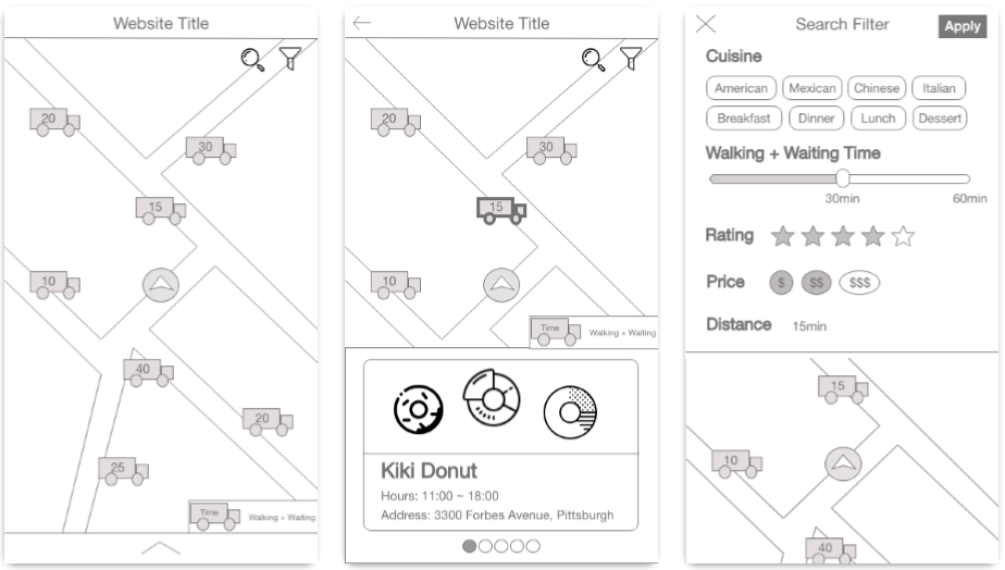
Initial Sketches and Wireframes
Given that there were three key players in the field, we decided to focus on designing the application for customers since the research we received had more interviews and information regarding those who patronize food trucks. With that in mind, we started sketching our application on paper. We designed for mobile first since it is easier to scale up than the scale down.
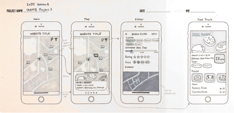
Caption: Initial black-white sketches of the application. Given that customers prioritize quality, convenience, and/or cost, we decided to focus on fleshing out our filter function.
Following our black and white sketch, we created more pages for search, filter, and navigation. In this stage we converted our original sketch into a wireframe with interactive task flows using Adobe XD. This will make user testing much smoother.
Think Aloud Protocol for Usability Testing
Using the think-aloud protocol, we tested our low-fidelity prototype with five other individuals. We asked users to think aloud as they performed the following tasks:
- There is only 25 mins left before class, please identify the truck you want to go to.
- Your parents are in town. They want to eat some Chinese food. Please find a food truck to go.
- Now the food truck Kiki Donut is in town and you heard it’s pretty good. It’s 10:55 and you are having a class at 11:20. You’re wondering whether you can get it or not.
- You heard the panda donuts in Kiki Donut are really good but you have only 5 dollars left. How can you find out whether you can afford it or not?
Here is a summary on what we did well/not-so-well at this stage:
Strengths:
- Trucks were easily identifiable, location of user was made clear
- Searching for trucks, identifying item and price of menu item were some of our strongest features
- Core functionalities easily identifiable and usable
- Other than the fact that some features were not implemented on the wireframe, there was no struggle accessing features on the wireframe
- Overarching feedback: no outright difficult task
Weaknesses:
- Primary Concern: Supporting/non-core functionality icons lacked clarity
- Numbers are present with no explanation
- Legend lacked clarity
- Confusion regarding arrow on bottom page
- Calculation of “distance” is not clear
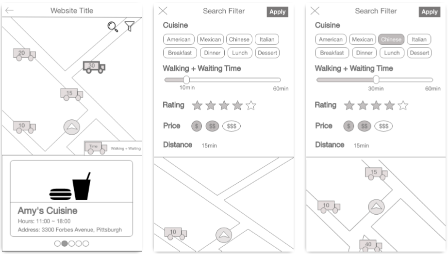
Changes Made
With verbal feedback and observational feedback from the think-alouds, in addition to advice from the instructor, we made changes to the following areas to mitigate confusions and create a more continuous flow:
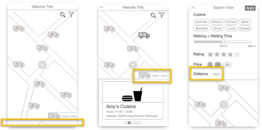
Caption: Previous wireframes with areas of improvements boxed in yellow.
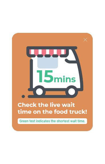
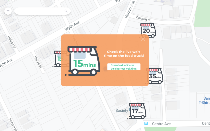
Caption: Tutorial screen shown to users when they enter application. Useful in understanding what the truck icons represent.
- Removed the arrow at the bottom of the map (left panel of wireframe) : We tried refining this feature by labeling it but realized that users did not use this feature intentionally and that the feature did not fit in with our main objective of cutting down time users take to choose a truck
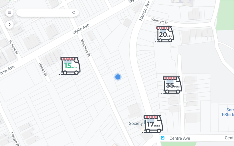
- Made labeling on truck icons easier to understand (middle panel of wireframe) : Instead of having the trucks with just their numbers on it and relying on a legend at the bottom of the map to explain what the numbers mean, we decided to eliminate the legend and label the trucks with the wait time in minutes on it. For example, instead of “15”, a sample truck would have “15 min” on the center of the icon.
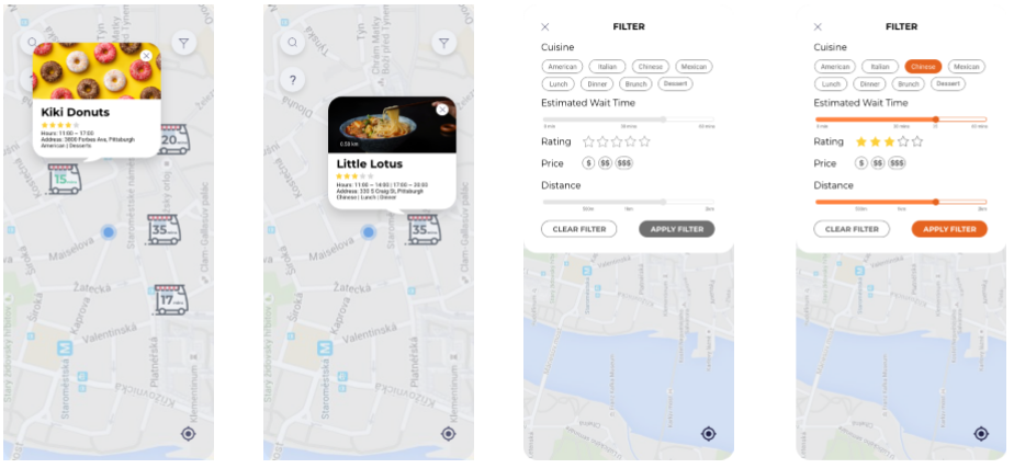
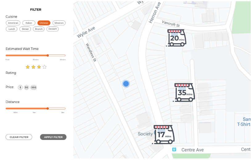
- Distance (right panel of wireframe) : Cognizant that users care more about the time needed to get their meals rather than the distance they have to travel to get their food, we made distance a preference on our filter rather than a feature we have on the front page of the map.
- Tutorial Screen (righthand side): We added a tutorial screen so users, before they open the app, will understand what the numbers mean and what a truck in green-colored text represents. With that in mind, users will have a better experience using the website to find a truck that fits their needs, whether it is dietary, time-wise, etc
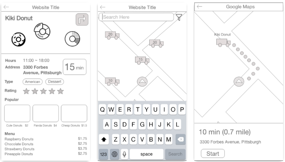
Final Iteration
Following these changes, we decided to create desktop prototypes, in addition to mobile ones, of the web application. Though panels of the final responsive web application are shown below, an interactive desktop version of the prototype can be accessed here. The mobile interactive version of the prototype can be accessed here.
Mobile Version
Desktop Version
Next Steps + Takeaways
If given more time to complete the project, we would add the following features:
- Payment directly from responsive web application
- Suggestions of where people eat after receiving food from specific vendor
Overall, the project taught me the importance of user testing since different sets of eyes understand features differently. For instance, the lack of explanation for any number we included confused those that tested our wireframes. Explanations, especially on tutorials and legends, should be straightforward as well, since users want to gain the information in a quick and easy manner.
As a team, we learned how to pitch a product as a team and design a presentation to fit that pitch. Because we received research results from a different team, we learned how to aggregate valuable data from unfamiliar research results to develop a design direction and product idea.