Caption: Instructor view of the game design course dashboard where some functionalities include being able to moderate discussion + feedback
Game Design Course Dashboard
Fall 2019 | 3 Weeks
"How might we design dashboards that enable students and instructors to give effective feedback for in-class presentations?"
In a classroom, everyone is there to learn and get feedback. Students want to learn more about game design, for example, and receive suggestions on how to improve their skills. Instructors want to know how well they are relaying the content such that they can achieve students' learning goals. However, there are roadblocks that prevent students and insturctors from getting the feedback needed, especially during presentations: students are easily distracted, instructors how well students have grasped the information.
To enable streamlined viewing and giving of feedback during a presentation, I created dashboards with two modes:
- Student Mode: Dashboard in students can provide real-time feedback to presenters and upvote other individuals’ comments
- Instructor Mode: Provide real-time feedback during presentation and monitor comments from rest of students
This project was done for the Interaction Design Overview Course (05-392) at Carnegie Mellon. To skip directly to the final deliverable, please click here.
My Role
In this individual project, I was a User Experience Designer and performed tasks related to the following: user-interface design, prototyping, and animation.
Process Overview
The following lists what I've done in order to reach my final dashboard designs: understanding the users, making rough concept sketches that later turned into black-and-white digital sketches and digital color sketches.
Understanding Our Users
Though only two dashboards were needed at the end, the dashboard was created around the needs of three types of users: student listeners, student presenters, and insturctors. Since each group has their own needs, I started off by creating an empathy map of the three groups. In this map, I included group feelings, actions, goals, pain points, and influences.
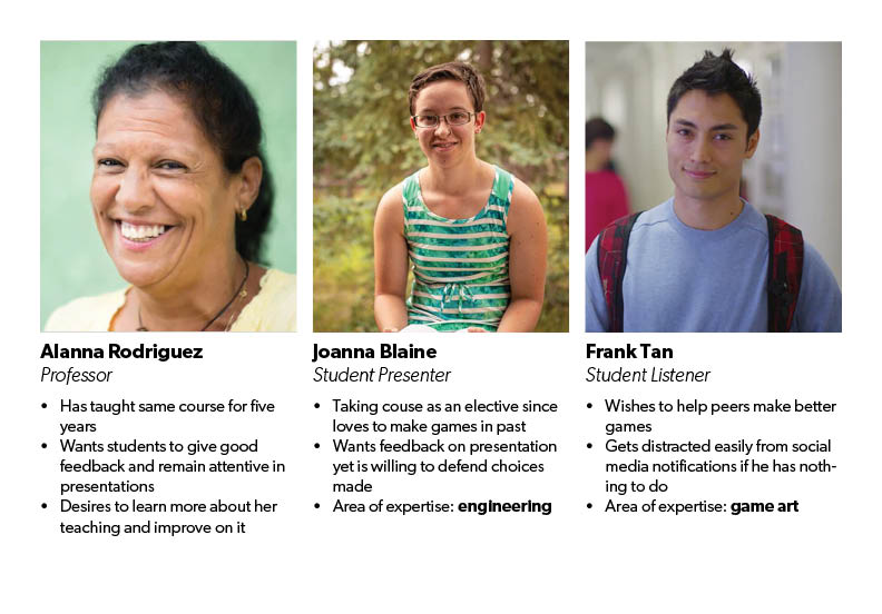
Caption: Personas of three individuals (one from each group) in the classroom, each with different objectives during the presentation.
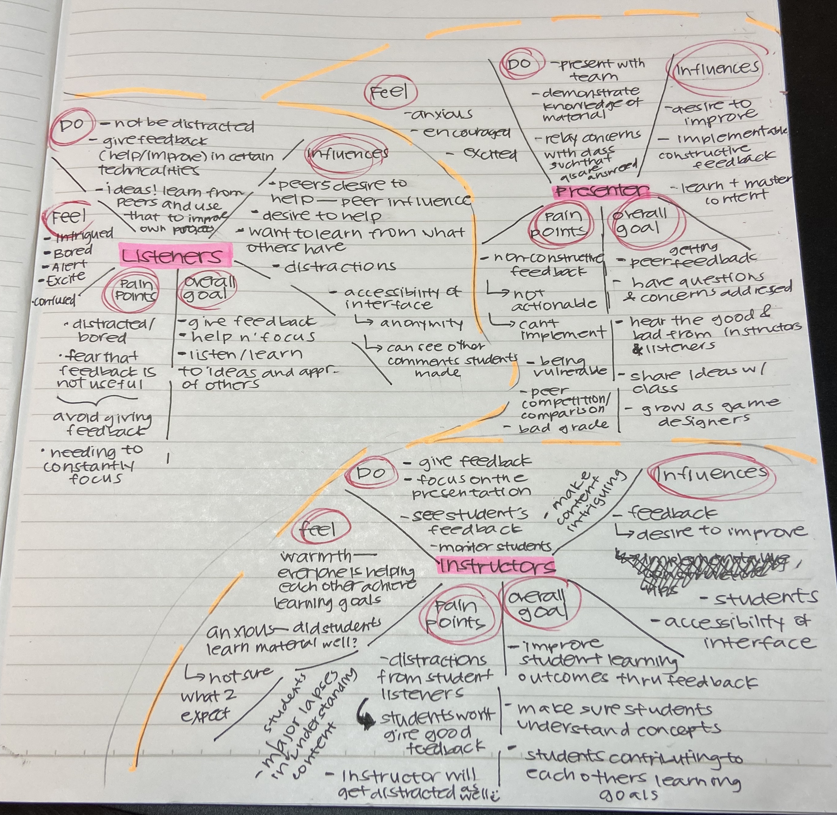
Caption: Empathy maps created for the three different groups.
Despite having different goals, these groups had some needs and fears that were quite similar. Thus, I created a Venn Diagram between the three groups. Though our diagram doesn’t have everything they share, the image below reflects a significant amount of their commonalities/similarities.
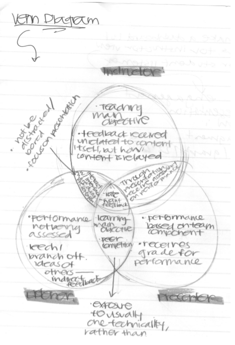
Caption: Venn diagram between three groups: listeners, presenters, and instructors
Rough Concept Sketches
After mapping and diagraming the needs, pain points, and goals of the three groups, I wanted my rough sketches to focus on the following:
- Simplicity: I wanted the dashboards to be as simple as possible such that users can shift their focus towards the content of the presentation.
- Filtering: Having a good filtering system would enable users to give/receive targeted feedback, enabling them to improve upon weaknesses.
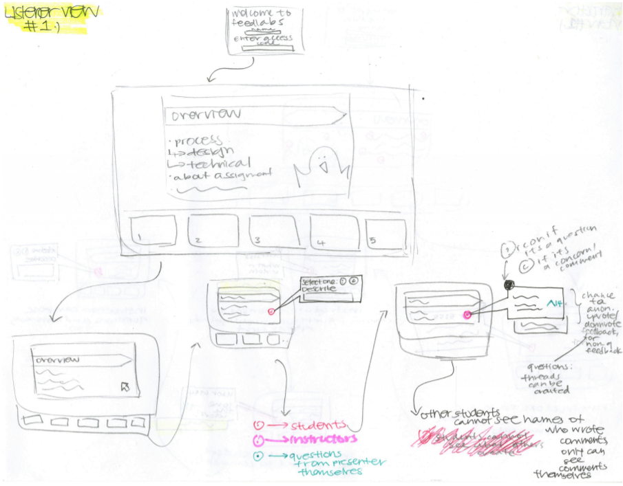
Caption: Listener version of the dashboard sketch. Users would use an access code which enabled them to comment on the slides directly. If a listener had a comment, or a question, on a topic, they would just comment on it directly. The main focus of the design was on the presentation, and the users ability to dynamically interact with what was written, spoken verbally, and what all members of the class thought.
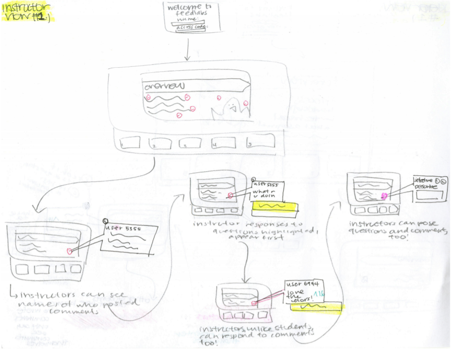
Caption: Instructor version of the dashboard sketch. Design rationale was similar to that of the listener version with additional features: instructors are able to comment on other comments to ensure comments are appropriate and beneficial to the presenters, and see user-names on comments to understand mastery of concepts from each individual student
Here is some feedback I have received after the first round of critiques:
- The entire dashboard should not be presentation-focused since it takes away attention from what speakers are actually saying
- My dashboards placed a heavy emphasis on simplicity which is good, since it eliminates distractions, but also lacks core functionalities and might cause listeners to fall asleep and not be engaged.
Knowing that I should work on these points, the main concern at the moment was balancing functionality and aesthetic. This will be a topic my black and white dashboard will aim to address.
Black and White Digital Sketches
I learned the need to balance functionality and simplicity through feedback from my last sketches. By utilizing typography and the grid types, like the golden section, I was able to add more functionality without sacrificing making the design too complex.
Listener Version
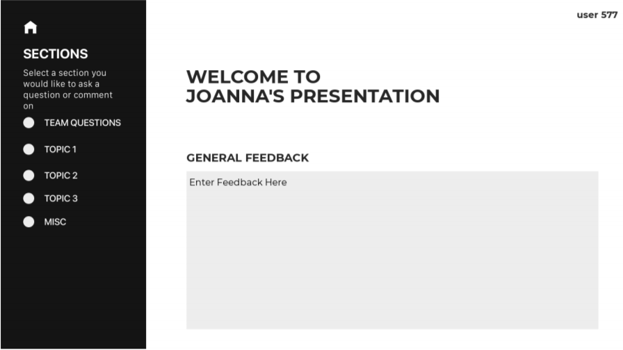
Caption: Home page of the listener dashboard, in which users can give general feedback to presenters
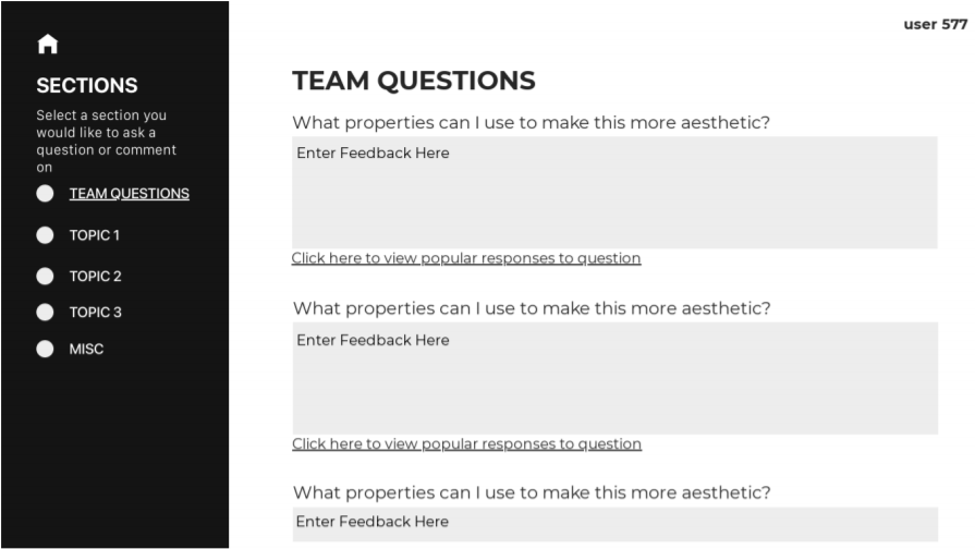
Caption: Team questions page of the listener dashboard. Users can give answers to team questions presenters may have.
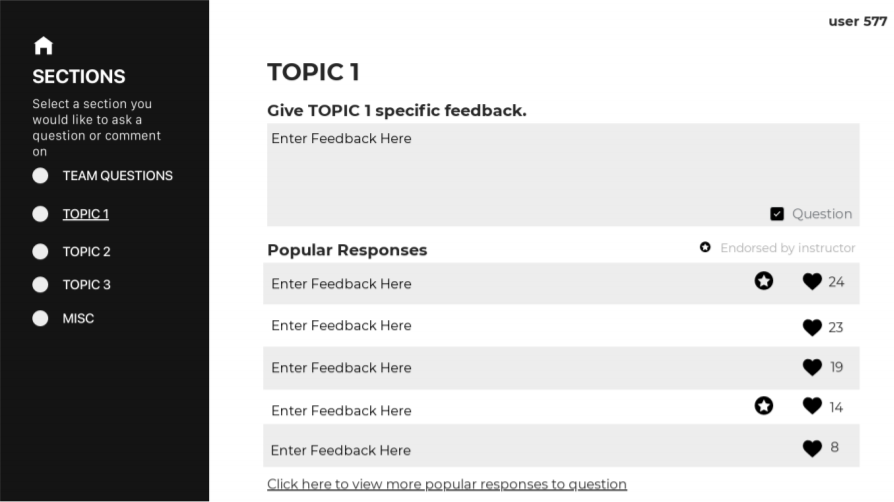
Caption: Topic page of the listener dashboard. Users can give feedback on specific topics.
This time, my design had a really clear point of entry. The contrast between the black sidebar and the white background allowed for both sections to be emphasized. The gray text box welcomed users to add in their own thoughts, opinions on the presentation as a whole. The black sidebar encouraged users to add category-specific feedback to those sections, as well as answers to the presenters questions. The design had core functionalities and allowed listeners to give feedback and listen to what the presenters are saying.
In addition, I shifted the focus of the dashboard from it being presentation-focused to topic-focused. Having additional pages where users can either give topic-specific feedback or help answer greatly improves the functionality of the dashboard, as listeners are motivated to give targeted feedback to the presenters.
Instructor Version
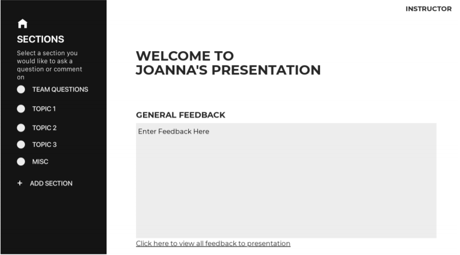
Caption: Home page of the instructor dashboard, in which they can give general feedback to presenters
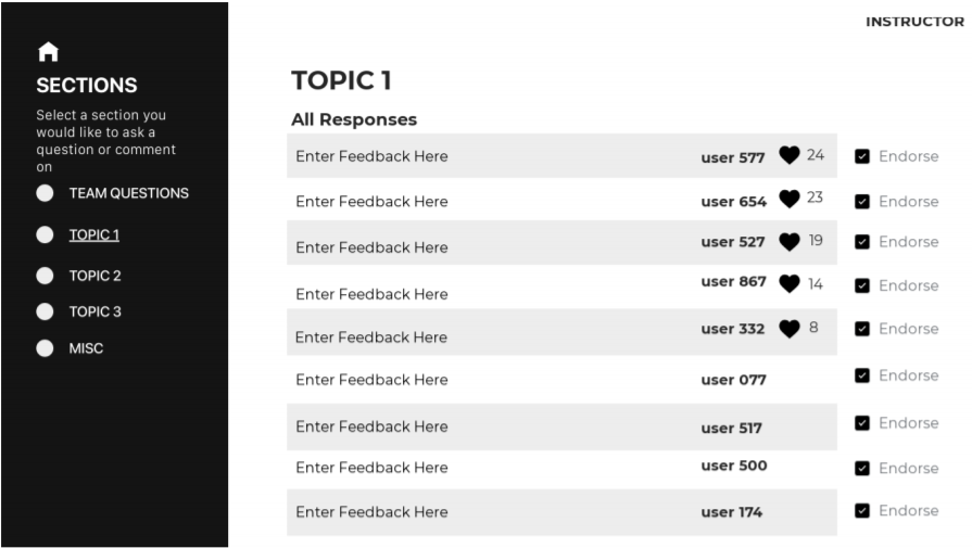
Caption: Topic page of the instructor dashboard, in which they can moderate dicussions around a certain topic
The design rationale for the instructor view was pretty much the same as that for the student view. There are several key differences:
- Instructors can give general comments and see each student’s general comments. Based on that feedback, the instructor can tell whether students have mastered the material or not.
- To allow instructors to facilitate the flow of discussion, instructors can add topics to the bar of the conversation.
- Instructors have the power to endorse comments and give general feedback. However, they cannot give topic-specific feedback since it allows for instructors to observe how conversations are going naturally, showing knowledge of concepts learned in class.
Feedback Received
Here’s what I learned from direct student feedback and inspirations from other presenters during critiques:
- Many features/tabs on website = high chance of distraction. Putting all the information in one spot or place will get the point across and make dashboard easier to use, as functionalities are located all in one spot.
- The incorporation of analytics and gauge to see which students were active/inactive is really beneficial for the instructor. This included graphs, statistics, percentages.
- Things I should continue to do that day: grayed out text box asking for general feedback, endorse/likes, black-white layout.
In all, what I learned from critiques was that simplicity was a good choice to make, but it is now time to bring all the functionalities together to make an accessible and non-distracting dashboard.
Color Digital Sketches
While I added color at this stage of the process, my main goal was to refine and bring the functionalities that spanned many pages together into one dashboard each.
Listener Version
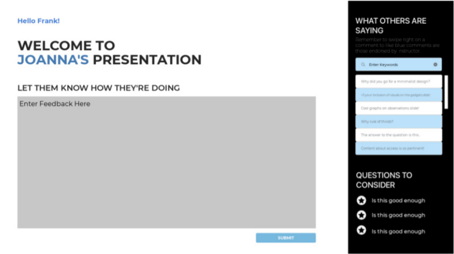
Caption: Color sketch of the listener dashboard. This time around, I made sure the features all in one page to limit distractions users may have during the presentation.
In terms of color, I decided to go with lighter, duller, shades of blue since it emphasizes text without becoming too distracting and powerful. I chose shades of light blue for instructor-endorsed comments since it popped out out of the shades of white and black, allowing it to be emphasized just the right amount. Darker shades went well with text embellishments, as it paired well with the black text and white background.
In terms of the black side bar, I added two features: livestream of comments and questions to consider. Comments from all students will appear on this bar, and students can search through them using the search bar or, they can swipe right to like the comments. The questions are also on the side bar so students can think about the questions throughout the presentation, and answer them as the presentation progresses.
Instructor Version
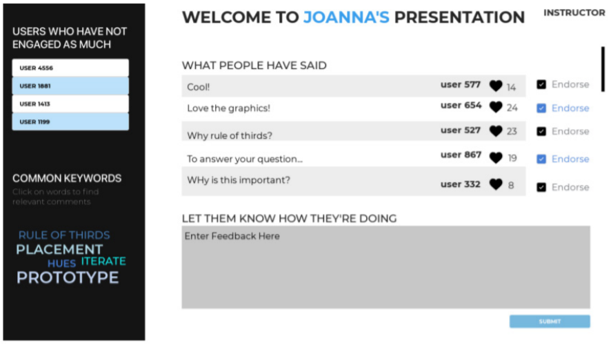
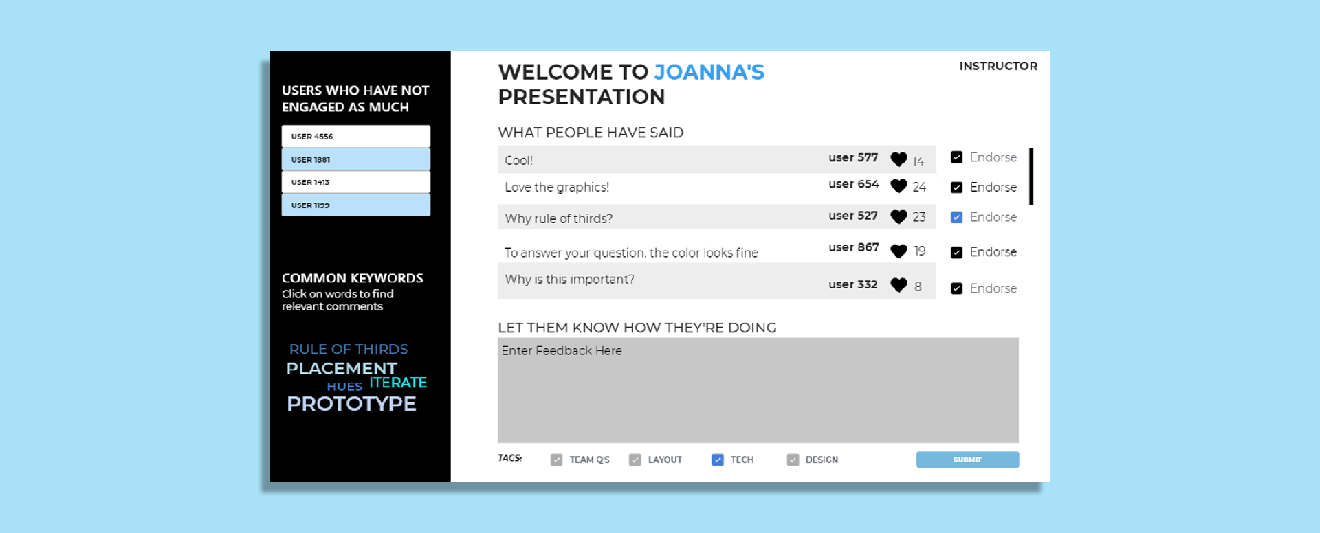
Caption: Color sketch of the instructor dashboard. This time around, I added analytics and information on students that have not participated as much yet.
Inspired by the insights incorporating analytics can bring, I decided to incorporate some here as well. On the black side bar, I added users that have not yet engaged as much. This gives the instructor a chance to check in with those that may be distracted, not engaged, or lost. The second section I added was the common keywords: it allows the instructor to peruse through topics that students are frequently mentioning in their responses. The size of the word correlates to how frequently the word was mentioned.
In terms of the content in the white box, it is split evenly between seeing what comments should be endorsed and a place where general feedback can be given. I figured that as an instructor, they do both conversation moderation and feedback-giving as well, explaining the need to split the section evenly.
These designs allowed for most core functionalities to exist in one spot while keeping the dashboard simple and usable, which is an improvement from the last one which had many tabs and features.
Feedback Received
At this stage of the process, I received the following tips to improve the aesthetics and functionality of the dashboards:
- The placement of the black side bar was not consistent and did not make sense. The viewer’s attention is first directed to the white box on one version and in another version, it is directed to the black box first.
- Adding category tabs to each comment will allow grouping of comments to happen more easily/accessibly
- A lot of the text is too thin, not readable
Final Designs
Listener Version
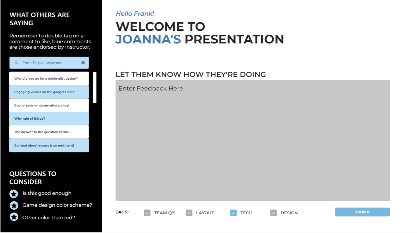
Caption: Final design of the listener dashboard
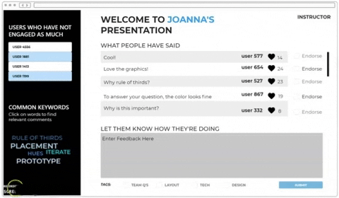
Instructor Version
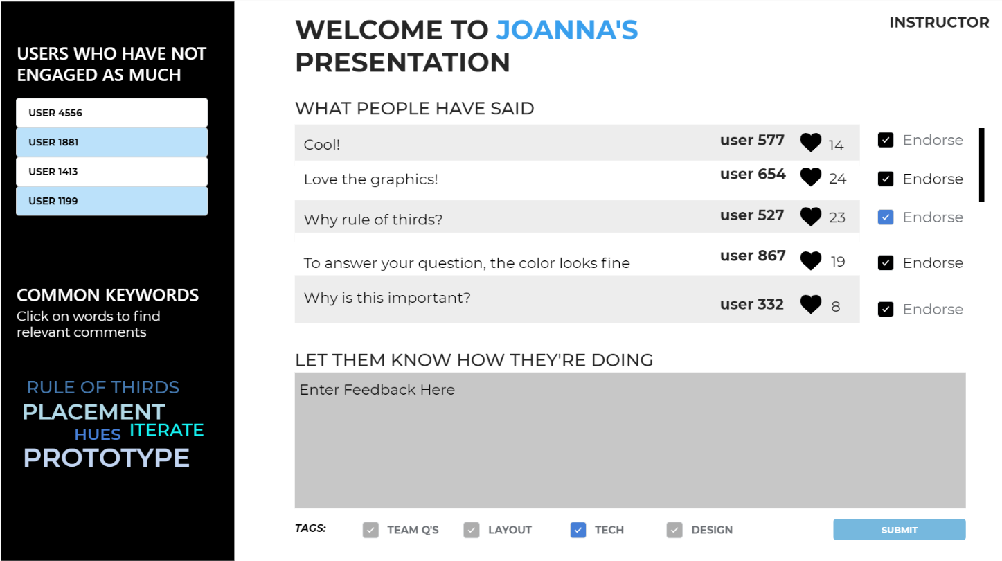
Caption: Final design of the instructor dashboard
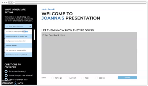
Animated Versions
Listener version to the left, instructor to the right.
Next Steps + Takeaways
Moving forwards, I would love to incorporate data visualizations and graphics that display student activity throughout duration of presentation and the robustness of comments in the instructor view of the dashboards.
Throughout the process, I learned how colors contrasts and grid layouts can direct the focus of users. Though it took me a while to understand how to leverage these these tools, using them effectively can establish clear points of entry and continuous flow throughout the dashboard, allowing their needs to be met in an efficient and easy manner.